Typography is a defining element in creating digital experiences, impacting how users interact with information, perceive brands, and engage with content. As designers craft intuitive, memorable websites, staying on top of the latest typography web design trends is more important than ever. As technology and design preferences continue to evolve, understanding how typography shapes online narratives has become essential for anyone striving for innovation and clarity in web design.
From classic letterforms returning to prominence to cutting-edge digital type features, the typographic landscape is rich with new possibilities. The most effective websites combine readability, aesthetic appeal, and brand alignment, all of which hinge on careful type choices. As brands look to create distinct digital identities and seamless user experiences, typography acts as both a practical tool and a creative asset, spanning everything from storytelling to interactivity.
By embracing current trends, designers are positioning their websites at the forefront of modern digital communication, ensuring both usability and unique visual impact. Keeping up with industry shifts can feel daunting, but understanding the latest in type innovation is the first step towards crafting compelling digital journeys.
To help you stay ahead, this guide explores the five major typography trends defining web design this year, so you can apply them thoughtfully in your next project.
See also: The Lifesaving Role of Drug Addiction and Mental Health Treatment Facilities
The Resurgence of Serif Fonts
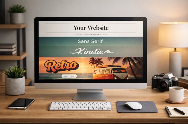
After decades dominated by minimalist sans-serif styles, serif fonts are experiencing a significant resurgence in web design. Modern serif typefaces such as Fraunces, Newsreader, and Playfair Display offer designers a way to infuse digital experiences with warmth, sophistication, and a unique personality. Their distinctive features lend depth and character, making them ideal for editorial platforms, luxury goods, and brands seeking authenticity. Recent trends highlight a shift in consumer desire for design choices that evoke trust and heritage, which well-crafted serifs can provide.
Embracing Variable Fonts
Variable fonts represent one of the most impactful technological advances in typography. By incorporating multiple weights and styles within a single file, they significantly reduce page load times and boost site performance. Designers now have the flexibility to fine-tune how fonts appear across devices and at different sizes, resulting in more adaptable, dynamic designs. This innovative approach not only benefits user experience but also enhances the visual variety available for interactive elements and branding. As outlined by Smashing Magazine, variable fonts are transforming both the process and results of modern web design.
Incorporating Kinetic Typography
Kinetic typography, which introduces animated movement to text, has grown in popularity as brands seek creative ways to hold users’ attention. From subtle fades and type-on effects to more elaborate animations embedded in site navigation or product messaging, these dynamic elements can lift engagement and relay messages more effectively. Motion-driven type is especially powerful in interactive websites and media-rich portfolios, ensuring that key messages are noticed and remembered. As motion becomes a staple of digital storytelling, kinetic type offers a lively, memorable twist to static content.
Minimalist Sans-Serif Dominance
Despite the resurgence of serifs, minimalist sans-serif fonts like Inter, Roboto, and Open Sans remain foundational to digital design. Their clean, unobtrusive forms are engineered for excellent readability across screen sizes, making them a go-to choice for interfaces and content-heavy websites. These fonts prioritize clarity and functionality, aligning perfectly with user-focused design and modern aesthetics. The widespread adoption of these typefaces underscores the ongoing appeal of simplicity in helping users navigate digital products efficiently.
Retro-Inspired Typography
Retro typography is enjoying renewed interest, with designers drawing inspiration from the visual style of the 1970s, 1980s, and 1990s. These typefaces channel nostalgia but are often redefined by contemporary touches in color, layout, or composition. This fusion of old and new brings a bold, playful character to websites and helps brands stand out in crowded markets. Brands seeking to connect history with the present often turn to retro fonts for headline treatments, creating memorable digital experiences.
Conclusion
Typography in 2026 continues to shape engaging digital experiences by blending creativity with functionality. Designers are increasingly using expressive typefaces to establish brand identity while maintaining readability across devices. Modern serifs add sophistication, variable fonts improve performance and adaptability, kinetic typography enhances user interaction, and minimalist sans-serifs ensure clean, accessible interfaces. Retro-inspired fonts also introduce personality and nostalgic appeal without compromising usability. By thoughtfully combining these trends, businesses can create visually compelling websites that capture attention, strengthen communication, and support accessibility. Keeping typography current allows websites to remain memorable, user-friendly, and aligned with evolving design expectations and audience preferences.